When you come back from a shoot with 400+ photos, staring at that grid can feel overwhelming. Where do you even start? Whether it’s a branding session, event coverage, or headshots, the editing process is the same. Over the years I’ve landed on a workflow in Adobe Lightroom that keeps things moving, keeps things consistent, and doesn’t leave me second-guessing every slider.
Here’s the whole process, start to finish.
Step 1: The First Pass – Find the Keepers
Before I touch a single slider, I need to figure out which photos are worth editing in the first place. I do this in Lightroom’s Library module rather than the Develop module. The Library tab loads image previews much faster, which matters when you’re clicking through hundreds of photos.
I go through every image and flag the good ones with a 2-star rating.
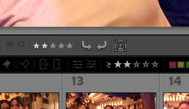
This isn’t about finding perfection. It’s about spotting potential. Sharp focus, good expression, solid composition. If a photo makes me pause for even a second in a good way, it gets 2 stars. Everything else stays at zero.
The key here is speed. I’m not zooming in to check every pixel. I’m trusting my gut and moving fast. You can always come back, but getting bogged down on the first pass is where editing sessions go to die.
Step 2: The Second Pass – Kill the Duplicates
Now I’ve got a filtered set of 2-star images, and there are always duplicates. Three nearly identical headshots where the only difference is a slight head tilt. Five shots of the same moment from the same angle.
I go through the 2-star photos and compare the duplicates. The weakest version of each group gets dropped to 1 star. Maybe the timing was slightly off, or one is a fraction softer than the other. The 1-star images aren’t bad. They’re just not the best version of that moment.
A handy tool here is Lightroom’s Survey mode (press N with multiple photos selected). It lays your selected images out side by side so you can quickly spot the weakest one in a group. Compare mode (C) works great too when you’re down to two similar shots.
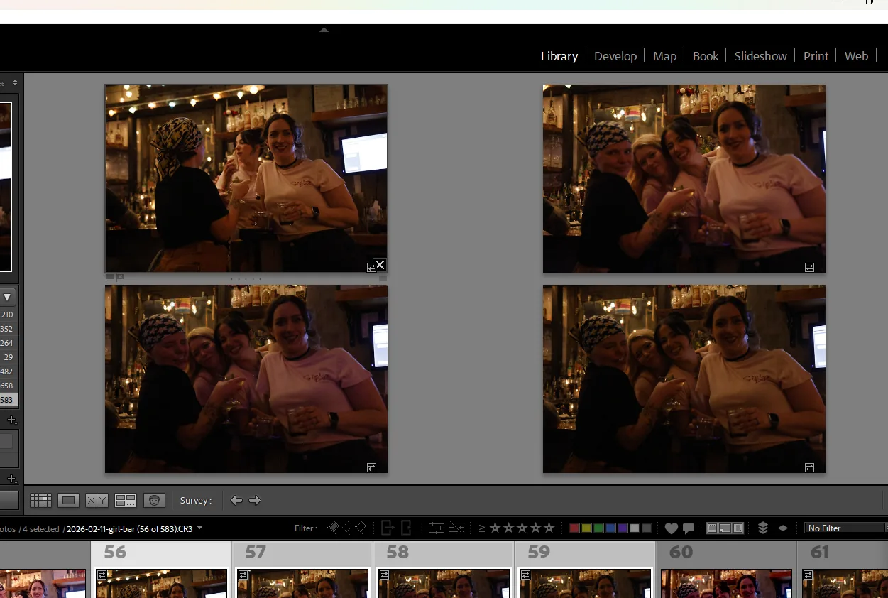
After this pass, I filter to show only 2-star images. That’s my working set.
Step 3: Edit One, Apply to All
Now I switch over to the Develop module. This is where the magic happens.
I pick one photo from the set. Usually one that looks good exposure-wise and is a strong candidate for the cover image of the gallery. Something representative of the overall lighting and feel of the shoot.
I edit that one image exactly the way I want it. That means dialing in:
- Basic sliders – exposure, contrast, highlights, shadows, whites, blacks
- Color grading – setting the mood in the shadows, midtones, and highlights
- Color mixer – fine-tuning individual color channels for hue, saturation, and luminance
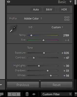
The color mixer is worth calling out. Each color channel has its own hue, saturation, and luminance slider, which lets you target specific colours without affecting the rest of the image. For example, if someone’s skin is pulling too orange under warm lighting, I’ll shift the orange hue slider slightly toward yellow and pull the saturation down a touch. It’s subtle, but it makes a big difference. I’ll go deeper into the color mixer in a future post.
Once that one image looks right, I select all the 2-star photos and paste the develop settings across the board. I usually do this from the Library module’s thumbnail grid using Ctrl+Shift+V (Cmd+Shift+V on Mac). In one move, every photo in the set gets the same treatment.
This is why shooting consistently matters so much. If your white balance and exposure are in the right ballpark in-camera, one set of edits can carry the entire shoot.
Step 4: The Reference Window – Consistency Check
Pasting settings gets you 90% of the way there, but not every photo was taken in identical conditions. Maybe the light shifted. Maybe you moved from a window to an interior wall. Those photos need individual attention.
This is where Lightroom’s Reference View comes in. In the Develop module, hit Shift+R to enter Reference View. I lock my hero edit into the reference panel, then flip through the rest of the set one by one.
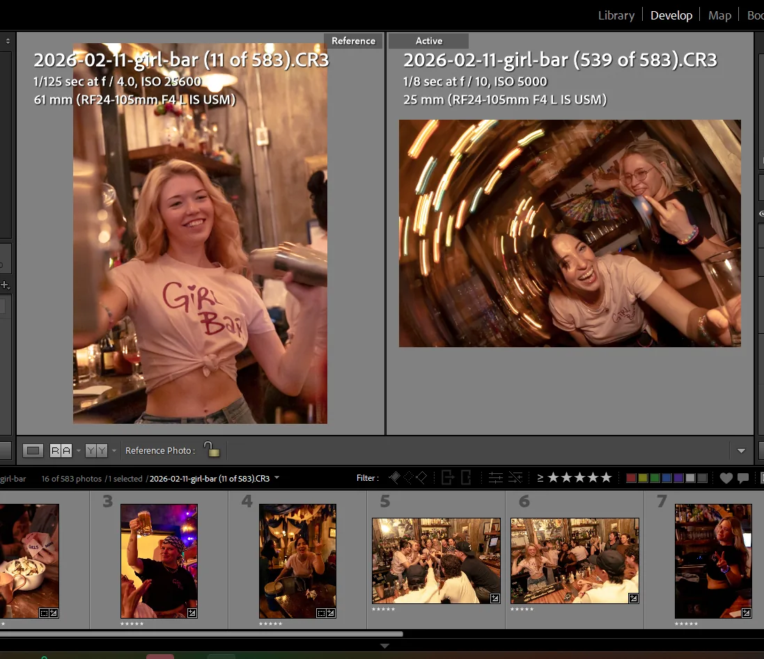
With the reference image right there beside whatever I’m working on, I can see immediately if something’s off. Skin tones running warm? Shadows too deep? I adjust the sliders until the current photo matches the reference, and move on.
It’s like colour-matching paint samples at the hardware store. You need them side by side to really see the difference.
Step 5: Handling Client Edit Requests
After delivery, sometimes a client comes back and asks for adjustments. Maybe they want the photos warmer, or a bit brighter, or they need the background toned down for a specific use.
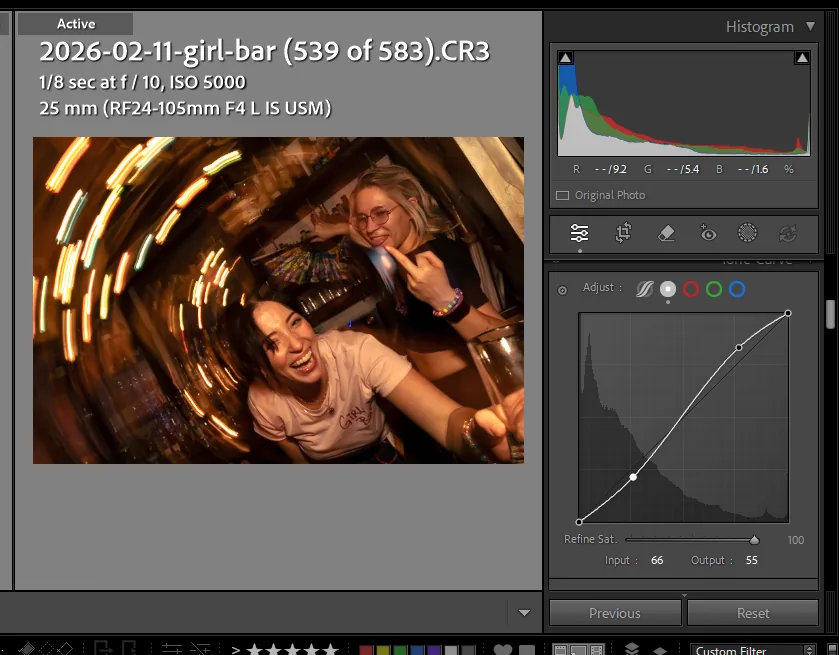
For these requests, I use the Tone Curve tool rather than going back to the basic sliders. Think of the tone curve as a layer on top of the finished edit. My original work stays intact underneath, and the curve adjustment sits on top. That way if the client changes their mind or wants to go back, I’m not rebuilding the edit from scratch. The whole workflow stays non-destructive.
When I copy and paste just the tone curve settings to the rest of the batch, it applies the client’s requested change uniformly without knocking anything else out of alignment.
Then it’s back to the reference window to make sure the batch still looks cohesive. The process repeats for each round of feedback: adjust one, apply to all, verify with the reference.
Why This Workflow Works
The whole approach comes down to one idea: edit once, verify everything. Instead of making 200 individual editing decisions, you’re making one good decision and propagating it. The reference window is your quality control.
When a client scrolls through their gallery and every photo feels like it belongs together, that’s not an accident. That consistency is what makes a set of photos feel professional, and it’s what keeps clients coming back. It’s the same principle behind how I approach content for this blog – build a solid system, then let it carry the load.
This also means faster turnaround. When your editing process is systematic, you’re not spending hours agonizing over individual photos. You’re spending that time where it counts: on the one hero edit that sets the tone for everything.
Want to see what this looks like in practice? Take a look at some of our recent work, or get in touch about your next shoot.
Leave a Reply
You must be logged in to post a comment.